Friday, October 27, 2017

Week of Swaps--Day 5


This is the last of swap postings. The day has been dedicated to making envelopes. These envelopes are approximately 6 by 7 inches. They are made from an old book that was left out in the elements by a Goodwill store. Many of the pages were water damaged or warped so I took the book home hoping that I would be able to do something with it.

I cut the spine open so I could separate the pages without getting a jagged edge. This is important because you need all clean edges because of the size of this envelope.

For this swap, you send your partner a postcard that you want returned to you. You place the postcard in an envelope and then address and stamp the envelope. Your partner will take the postcard you have addressed to yourself, write something on it and place a stamp on it. The card will receive local postmarks and stamps. Of course, rather than send a plain envelope I had to send something special and I included some miscellaneous items for my partner to keep.

More envelopes

Even more envelopes


Thursday, October 26, 2017

Week of Swaps--Day 4


Today's swap was a homemade postcard swap. Since I post about coloring often, people always send me coloring sheets like the above. I have hundreds of them. Unfortunately, many of them are patterns that I don't care to color. For coloring, I tend to gravitate to larger open areas that I can work on technique or amend with my own doodling. I am always looking to find something to do with these coloring sheets.

The first step is to design the color palette. I used three yellow/orange shades for the random teardrops/dots.

I used four green/blue shades for the smaller amoeba shapes. For the larger  amoeba shapes, I used a reds, greens, blues, and purples. I used five shades of each color to complete each palette. Granted I could have stopped here, made one postcard and have been done.

Color palettes completed
I chose to continue using the same color palettes but reversing darks and lights. Once the top half was completed, I could have stopped which would have provided several options for a single card.

Top half completed
I continued to fill the entire sheet. The goal was to make two separate postcards.

Full page complete
I then ran my postcard watercolor stock through the Xyron machine and mounted the cards to the coloring sheet using a light box to get the best placement possible.

Two postcards
Postcard front and back
All I need to do is clean up this mess of a desk. As you can see, I keep notes for reference during the project. I also keep all of the markers out and available until the project is completed. After getting to the end of the full page coloring, I realized that I had forgotten to color a single teardrop shape. I had the gold yellow marker still available. If I had to search for it, I would have taken a few more minutes to locate it. This is the main reason why I always keep a project reference sheet. Could you image trying to find the exact color that was used if I hadn't kept notes?


Time to mail out some postcards.

Wednesday, October 25, 2017

Week of Swaps--Day 3


Bunny Postcard

This swap was for two handmade postcards to a single exchange partner. I really like using postcard blanks because they are guaranteed to be an appropriate thickness to send through the mail. My partner like bunnies and coloring.

For the postcard above, I simply ran the postcard through my Xyron machine and then applied the card to this cute Japanese paper. I rounded the corners of the paper to match the postcard blank.

For the second card, I took one of my smaller stencils and used a extra fine tip Sharpie to trace the pattern onto the front of the card . Since my swap partner likes to color, I left it as is so she could provide the color and send it out to someone (should she choose to).


A quick and easy swap.

Tuesday, October 24, 2017

Week of Swaps--Day 2


Beach front envelope

Today's swap was a "doodled" envelope swap with items. The idea was to doodle on an envelope and then fill it with two items from a list of items that  your partner would like to receive. Of course, because I have so much product, I always try and send more items than required. On these types of swaps, I put a limit of $3 on postage (although, it would be quite less if I simply sent the two items).

The swap organizer does not stipulate what size envelope to send. I think the goal is to send a business sized envelope and the additional ounce stamp (70 cents) so that the cost isn't prohibitive. I always shoot for 4 ounces (which is the $3 limit including postage for a rigid/thick (more than 1/4 inch) envelope). The envelope is 6 by 9 inches.

My partner liked the beach so I used some stencils and alcohol inks for the front of the envelope. Here is a starfish and a shell.

Envelope back

For the back, I chose a radiation type of stencil and decorated with my classic crosshatch doodling. And of course, I had to generate a plaid of some sort for the background. These were done with Tombow dual tip markers. My swap partner doesn't like neon colors so I used a primary color palette.

Monday, October 23, 2017

Week of Swaps--Day 1


Japanese setting sun

This week, I wanted to share with you some of the swaps that I have completed on swap-bot. The first was a postcard challenge. The theme was "put a map on it. " My swap partner has an aversion to anything purple so I had to get creative.

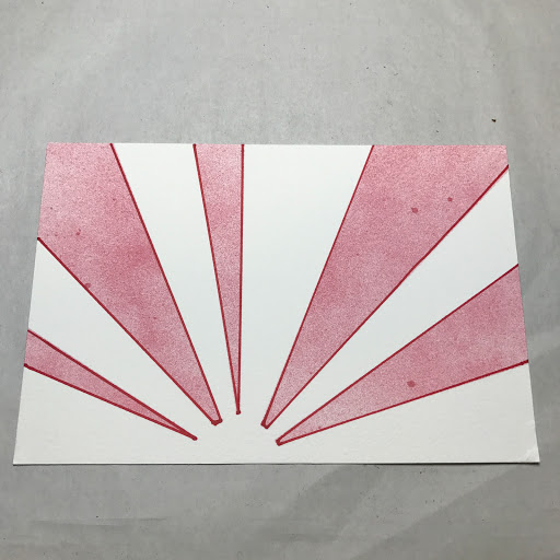
My partner likes blues and greens though. I knew that I wanted to do something with some scraps of Japanese paper that I had laying around. First I used my stencil that simulates the Japanese setting sun. I used alcohol inks to provide color. The layout worked in reverse than I wanted. Rather than start over, I simply decided to reconsider.

To simulate the sun, I decided to use my paper scraps to represent the sun's rays. I chose three coordinating papers and used the stencil to cut out the rays.
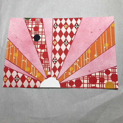
Sun's rays
I wasn't quite happy with the half-round shape that I achieved. I took a red crane piece of scrap paper and used a hole punch to punch a circle. I pasted it in place and trimmed so it was flush with the card.
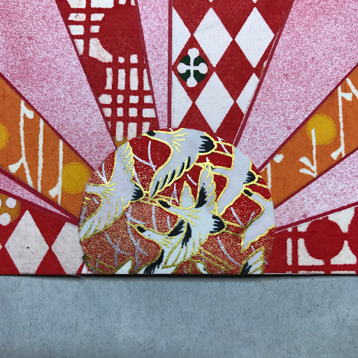
Much better
The upward flying crane is a symbol of good luck and it seemed appropriate.

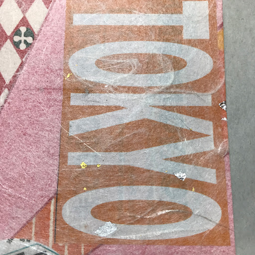
I still needed to add a map so I took the circle punch and added the two maps to fulfill the theme of the swap. One was in black and white and I was sure to use a non-purple section of the Tokyo Metro map. I added three other images from a free guide booklet to complete the front.
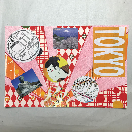
Getting there
I had picked out some postage stamps to use but I just couldn't figure out where to put them. The front of the card still needed something so I dug through my stash of decorative papers and found this metallic speckled mulberry paper. It is a see through paper normally used as an overlay in Japanese gift wrapping. The gold and silver flakes are supposed to be good luck for the recipient. I ran the card through the Xyron machine and placed the paper on top of the card. Unfortunately, you only get one chance to get this right. There was a lot of deep breathing during this stage.
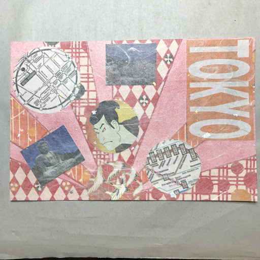
Finished card front
Mulberry paper detail
It then came time to concentrate on the back of the card. I had the perfect stencil to use--a koi stencil. I used my alcohol inks to create the koi. Remembering that my partner liked blues and yellows, I used those colors to fill in the background. My partner also collects used postage stamps so I added some Japanese stamps from my collection. I used the US-Japanese Cherry Blossom Forever stamp to apply postage (since the card is oversized, it requires first class postage).
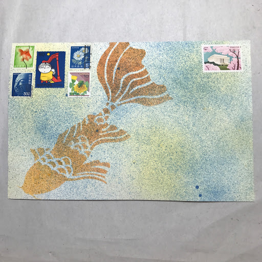
Finished card back
I hope my swap partner likes the card. It is on its way to Belgium.


Friday, October 20, 2017

Envelopes Part 5


This is the final entry in Envelope Week. This is one of my favorite papers from India. This is a pretty spider mum pattern that comes in three different color settings: purples, pinks and chartreuse/white. This is a thick and fibrous paper which doesn't hold a fold very well. When you line the paper with card stock, the creases hold much better. I have several of these but it just seems too painful to send them out so I tend to hoard them.


That it for this week. Have a great weekend and I will see you next week with some items that I have been sending out via swap-bot.

Thursday, October 19, 2017

Envelopes Part 4


Maple Leaves 
Continuing with Envelope week, this is one of my favorite envelope manifestations. These are envelopes made from decorative paper that is too thin or non-sturdy enough to go through the mail. They are reinforced with card stock so they will easily pass through the US Mail System. With all of the pretty papers that I have, this is so very satisfying for me. For example, this Maple Leaf paper is made in India and has a beautiful metallic ink that just glimmers.

The interior is lined with a patterned card stock in a complimentary color. Everything is secured with double sided tape.

Envelope Interior
Here is another example. This is a crepe printed paper from Japan. The thickness of the paper is equivalent to a crepe paper streamer. Alone, the paper would never make it through the mail.

Envelope Front
This envelope is lined with a thicker patterned card stock by Bazzill.


The biggest difficulty with these envelopes in how to address them. I suggest that they be used as part of a paper suite for special occasions where they are used as an inside, non-addressed envelope. I have used these in the past but have addressed the flap side of the envelope with a label. This allows the front of the envelope to maintain its presentation.

Wednesday, October 18, 2017

Envelopes Part 3


Today we are continuing our series of experiments with dried flowers and glassine envelopes. For this attempt, I decided to go back to a fully lined envelope and larger leaves. I had some leftover red maple leaves from another project so I wanted to see how these would work.

I like the look but I still need to find a way to place the leaves without getting smudges and other detritus on the glued surface. I have used my Xyron machine and have used spray adhesive. No matter what I do, I still get bits and pieces of material or dust on the glued surface. With the glassine paper used for the envelopes, every smudge and imperfection becomes highlighted. I have even used pointed tools (awls, skewers, and tweezers)  to try to reduce smudges.

Tuesday, October 17, 2017

Envelopes Part 2


Front View
Today we are continuing the week with handmade envelopes. Here is a second attempt to try and find the balance between materials and aesthetics. The above is the front of an envelope utilizing some dried leaves. The evergreen sprig to the left looks much better than the washed out leaves on the right. Unfortunately, the placement of the leaves provides limited space for addressing the envelope.

Back View
For the back, I decided to not line the top flap with card stock. The card that is being sent will provide enough heft for the envelope to be sent through the mail. Without the additional card stock on the flap, the dried leaves (or flowers) will show through the glassine flap. This will allow a larger variety of dried flowers to be used. Also, this will provide easier access to open the envelope. The bigger difficulty here is how to secure the envelope without glue or tape being visible.


Monday, October 16, 2017

Envelopes Part 1


Front of envelope

This week will be dedicated to envelopes. I have been making handmade envelopes for quite awhile but I haven't really shared my latest version. Right now, I am experimenting with glassine paper and dried flowers. This is my first attempt and while I am happy with some aspects of it, other issues have me scratching my head.

The first question is "how much is too much"? As you can see, it is easy to go overboard with the flowers and leaves.

Back of envelope (open)
The second question is "How do you secure the envelope"? Normally, I would be but a piece of double stick tape across the back flap horizontally. The problem with doing this is how to open the envelope without tearing the envelope and without destroying the flowers.

Back flap (top)
The third question is "how much overlap do I allow for the flowers"? Should the entire flower show on the back side of the envelope? If so, then this limits how many and what type of flower is used. If part of the flower is covered, do you get the same effect? Is anyone else going to care about it as much as I do?

Back of envelope (closed)
The fourth question  is "how to I tell the recipient to open the envelope carefully" and finally, "how do I prevent flower dust, parts, and other detritus from getting glued to the card." As you can see, the envelope is made in layers. There is the glassine paper and it is strengthened by white card stock. The flowers are glued directly to the card stock. The card stock is then placed in the Xyron machine and glued to the glassine paper.

This was a mock up for a bridal announcement. Of course, the bride changed her mind after the presentation.

Friday, October 13, 2017

More Mail Art


Another bird in the mail (front)
For today's mail, I had to do some research to determine the largest sized postcard that can be sent in the mail. The answer is 6 1/4 inches (short side) by 11 1/2 inches but you have to use first class postage. To use postcard postage, the postcard can be no larger than 4 1/4 inches (short side) by 6 inches. I was OK in that my postcard was 6 by 9 inches.

I had a leftover piece of this decorative paper that I wanted to use and it fit perfectly on the postcard. The image is too large for most applications but this worked out perfectly. I then used a hummingbird stencil to alter the paper. The recipient also likes used postage stamps so I looked through my stash to find bird postage stamps including a US hummingbird stamp to match the stencil.

Another bird in the mail (back)
Because I was afraid that the postcard wasn't sturdy enough to make it through the mail, I glued a piece of card stock to give it some heft. I then used some clear stamps to stamp the images. I colored the stamped images with Copic markers. I added two more used postage stamps to complete the postcard. I wanted to add more stamps but I realized that I needed room for the address and the greeting. Sometimes deciding when enough is enough can be very trying.

Since I had never dealt with this card stock, I didn't know how the Copic markers would react with the paper. Whenever I am unsure, I do a color study on a scrap piece of the same material. This way I can finalize the colors and see how they react with the paper and the paper's color.

Color Study 1

Color Study 2
The color designations refer to Copic markers.

Thursday, October 12, 2017

Mail Art


Birds in the mail (front)

I realize that I have been away from blogging for an extended period. With the holiday this past Monday, I just couldn't get things together to post. The biggest problem is that I forgot what I had already posted so I had to review the blog to see what I had already done. I have been sharing posts on Instagram so I get a little confused as to what has already been posted and where.

Today's and tomorrow's post will be mail art that I am sending out. This week it seems that everyone on my swap-bot feed is into birds. This person likes birds and bird houses.

Birds in the mail (back)

For the front of the envelope, I lettered the address and then used a stencil and alcohol inks to decorate. The recipient likes blues and pinks.

For the back of the envelope I did something a little different. I outlined the images with a Micron .01 pen. I then placed the stencil back on the envelope and sprayed alcohol inks to color the images. This was done in three stages. I used brown for the bird and bird house (while masking the bottom of the stencil). I then covered the top of the stencil and colored the pink flowers on the bottom of the stencil. I removed the stencil and sprayed a purple ink over the entire envelope.

Friday, October 6, 2017

Studio and Craft Hacks--Day 5


This is probably one of the hacks that I am most proud. I am forever shopping at Target and I will buy many items not knowing exactly what I am going to do with them. This was the case with these plastic trays that were available prior to this new school year. I was attracted to them because I thought they would provide a pop of happy color in my studio.  They were on sale for $3 each so I thought they were a bargain. They came in five colors (the four above and a nice blue). I bought the four colors shown and called it a day.

I didn't know exactly how I was going to use them. I got frustrated digging through my shoe box of washi tape every time that I wanted to use it. Unfortunately, if I don't see something, I won't use it. It was simply taking too much time to sort through my washi tape that I would just use something else.

I was searching online for a different product and I came across this image:


and I thought I can do that. I had the dowels and I was going to make my own box/case when I remembered that I these Target trays.

I decided to use my heavy duty bookbinder's awl to make the holes. I widened the holes to accept the size of the dowels that I already had. I then cut the dowels to size using my Exacto mini-saw and I was in business.

As you can see in the original photo above. The green tray was the first to design and I didn't realize how much space I needed between the dowels. Once I figured it out, the second and third trays were easy to assemble.

Tray one
Tray two
Tray three
Tray four
As you can see in the last tray, I left one without dowels so I could store my oversized rolls of tape. I really like how these worked out. I can see all of my tape at a simple glance. I don't worry about the size of the rolls or widths of the rolls as they are easy to access. There is also room for extra rolls that I have been too lazy to put back on the dowels. More importantly, this limits the amount of tape that I can get. I have started to follow my "new book" rule--before I can add a new roll of washi to my collection, I must get rid of one roll.


Thursday, October 5, 2017

Studio and Craft Hacks--Day 4


Postage Envelope

OK. So this might not be an earth shattering hack like an IKEA hack or something. But it is an organizational tool that is really helpful if you do a lot of mailing like I do. This is my postage envelope. They are really called check accordion envelopes in that they are supposed to be used for storing and sorting cancelled checks--but really, do people still write checks?

Some people use them for coupon sorting which is where I got the idea. Not only do I collect used postage stamps, I also collect current US postage--mainly because I mail lots of stuff. I have always needed to find the correct postage quickly and I came up with this idea.

Each of the folds holds an envelope with different postage. I keep the forever stamps nearer the front. After that, the stamps/envelopes are put in ascending order according to price.

Forever stamps up front
Stamps in ascending order
Marked stamps
On the outside of the envelope, I also label the special needs for certain type of stamp so it is easier to calculate postage. Additional ounce (Forever stamp plus additional ounce stamp).

Square cards cost more (and even more if they are overweight)
The big denominations are in the back ($1 and $2) plus all of the oversize stamps.


Also in the back are extra envelopes should I need to mail something out in a hurry (like bills, etc.). I have regular envelopes, decorated envelopes and handmade envelopes depending on the need and situation.

Special Envelopes

So, I always travel with my postage envelope. I just throw it in my bag or backpack and away I go.